Page Contents
In our ever-growing data-oriented society, having an easy way to access and understand data has become ever more important. That’s where data visualization becomes really helpful. Businesses can use visualized data to identify elements that impact customer interactions and areas requiring improvement.
It is a way to present data in a visual or graphic form and an effective way of communicating information and insights. Visual representation of data can be used in different fields, like business, education, science, and journalism. It can be used to show the relationships between two sets of data or to explore trends and patterns. It is most commonly used by digital marketers who want to know about the performance of their companies’ websites and their visitors using website heatmaps.
If you’re also a digital marketer and wish to increase your website’s conversion rate, you can use WatchThemLive as the best CRO tool that tracks user behavior on your website and presents the achieved data visually through heatmaps, graphs, etc.
What Is Data Visualization
When a set of data is represented graphically to gain insights and patterns data visualization definition comes up. Data and information visualization assumes that a user can more easily process visual representations and information exploration, which could make comprehending large amounts of information possible. The goal of information visualization is to create intuitive ways of presenting abstract and numerical information.
Visualizing data is a powerful method for data-driven decision-making. It can be used to explore the data, validate assumptions and identify relationships in the data. A chart or graphic illustrations are usually easier for the brain to digest than long, complex reports or numbers and tables. The convenience of data visualization makes it a time-effective way of conveying ideas to audiences – and you can play with different iterations and see how they might unfold.
Why Is Data Visualization Important
Visualizing data aids business and marketing analysts in gaining a clearer insight into their large data sets. The advantages include discovering patterns or mistakes that the naked eye cannot detect. Taking these patterns into account, the users will be more aware of issues that need addressing and how to improve. As a result, this approach propels the business forward.
It offers the following benefits as well:
- The capacity to quickly process information, sharpen one’s wit, and make quick, impactful decisions,
- A deeper understanding of the immediate actions required to be taken by the organization,
- An improved capacity to hold an audience’s attention by providing information they can comprehend,
- Distributing information easily increases opportunities for sharing insights,
- Take the pressure off of data analysts because data is easier to understand and retrieve.
- Greater effectiveness, with fewer mistakes and more quick goal achievement.
How Does Data Visualization Work
Visualizing data is the art of presenting data so that one can make observations and assumptions with just a quick look.
A visual representation of data is one of the most important facets of Data Science. It’s all about using shapes, lines, and other figures to illustrate numbers. Data can be presented using a variety of techniques depending on the type of data.
Almost everyone has seen data visualization examples in the form of pie charts, bar charts, and line charts. It can be easy to look at raw data and feel completely lost in a slew of numbers.
In order to comprehend how visualizing data works, we must first consider how our eyes and brain inform us of our surroundings. Every day, our brain assembles metaphors to help us understand concepts based on what we see around us. Similarly, data visualization also uses metaphors. As an example, consider how a pie chart demonstrates how different pieces fit into a whole pie. A line chart illustrates continuity, and a bar chart presents categories.
The power of visualized data derives from its ability to reveal information to us that would otherwise be out of our reach — It enables you to unveil patterns and order to what might have appeared to us otherwise to be a haphazard pile of digits.
What Is Data Visualization Used for
In today’s world, a large amount of data is collected by agencies and businesses every day, including website analytics, social media performance, location-based sales, returns on investments, incomes, and expenses. Information is designed to provide insightful perspectives and be a valuable guide for decision-making.
You can discover inconspicuous links between things happening in your business using visuals. You can measure connections between your product, content, and conversions that would otherwise be overlooked.
As a digital marketer, you are aware that useful data are those that tell a story or draw a big picture of events. There is more to it than just gathering lots of data. You need to get the right data and let it tell its own story. Some marketers and analysts may not have traveled in this area before.
This is where presenting data in visual form comes into play. Your web analytics strategy should revolve around it! How come? Even with tons of fantastic information at your disposal, it’ll be meaningless if you can’t find the right way to present it.
Hopefully, there is a variety of data visualization software enabling you to find out what is going on on your website, in a visual format, thanks to technology.
You can decode how visitors and customers interact with your website content, and where are the most engaging sections on your website, to put calls to action (CTAs) to increase your conversion rate.
What Are Different Types of Data Visualization
When you hear the term data visualization, what does it immediately bring to your mind? you may probably imagine simple charts. In addition to these fundamentals for the visual representation of data, it is crucial to match the right visualization methods with the right data. There is more to graphs than meets the eye. Hopefully, several visualization techniques are available to make data look clear, impressive, and eye-catching.
The following are some examples of different types of data visualization:
1- Charts
Charts are the most popular type of representing data. There are a variety of types of charts that are utilized for presenting data visually, such as bar charts, line charts, and pie charts, which represent the data through symbols. Charts can be used to convey many different kinds of information, like statistical data or detailed plans.
2- Tables
With a table visualization, you can view data from a metric set in a tabular format. Sometimes called a data grid or data table, a table is the default type of visual for your data unless you pick something different at first.
3- Graphs
Graphs reveal raw data in patterns and they allow you to compare different sets of information. Two-dimensional graphs consist of a horizontal line and a vertical line along the bottom. One axis goes left-to-right, and one goes top-to-bottom called X-Axis and Y-Axis respectively.
Graphs are lines and/or curves that are used to display the correlation between data points. In mathematics, a graph depicts the correlation between two or more variables, and the slope formula is one way to measure the steepness of a line on a graph.
4- Geospatial
Geospatial is an emerging technology that combines interactive visualization with traditional maps, an experience that goes beyond just looking at a simple map and affords the user the ability to look at multiple levels of a map, enlarge and reduce the size of the map, customize the map’s appearance, and tie in geo-information.
5- Dashboards
A dashboard is a tool that captures, analyzes, and displays important numbers like KPIs, metrics, and critical data points. Dashboards make it easy for any type of user to understand reports whether experts or juniors and they empower them to take an active role in business intelligence and decision-making.
Through compiling data and visualizing trends, users can understand performance metrics that are objective and easily observable.
Dashboards are visual representations of data, consisting of charts, tables, and gauges. They are used by management to monitor the performance of the organization in comparison to planned objectives and business standards.
Data Visualisation Examples
It’s understandable if you have a large, challenging dataset you want to portray. Visual aids can make the data less overwhelming.
So, here are examples to spark your interest.
#1 Heatmaps
Heatmaps are brand new and unique data visualization techniques that visualize data graphically where data points are represented by colors and are easy to grasp.

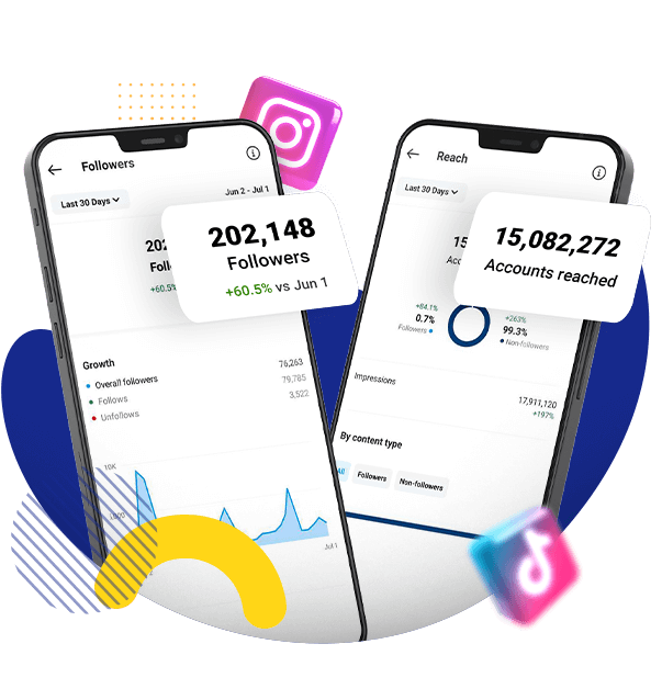
Heatmaps are great to visualize user behavior on your website in the form of colors and see what your visitors pay attention to and find where they click, scroll, or move their mouse mostly. WatchThemLive is a CRO platform that includes features to carry out user behavior analytics.
In this way, you will discover the areas on your website that need improvement in content, CTAs, product descriptions, etc.
#2 Line Charts
A line chart is a time-dependent tool that shows changing of variables over time intervals. There are different uses for line charts, but they are commonly used in business and technical fields. Data is an integral aspect of graphics that presents values and depicts changes in a time interval.
For example, a company in the FMCG market might use this chart for tracking the revenue amounts of its products in the last six months of the year.
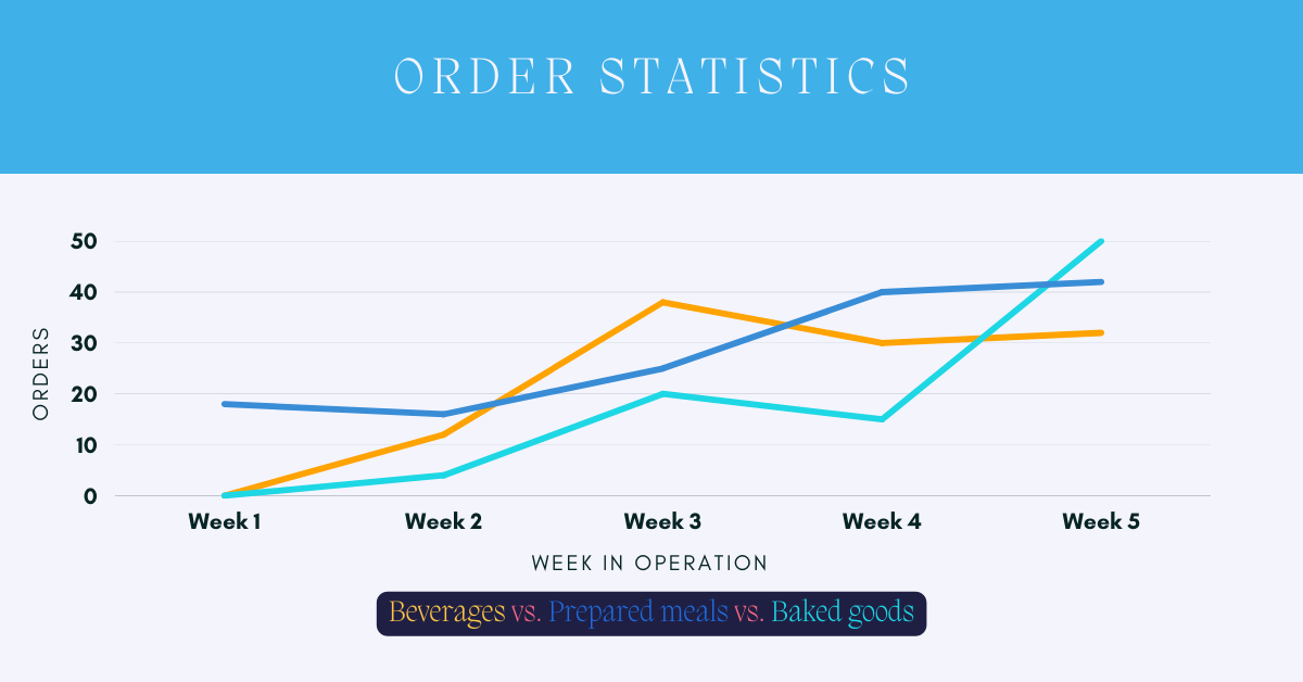
In the above image you can see the amount of orders for 3 items: Beverages, Prepared meals and Backed goods during the last 5 weeks.
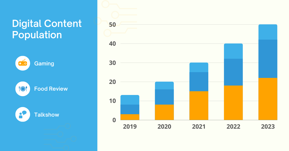
#3 Bar Charts
Bar charts are another useful tool that illustrates categorical data with a set of blocks where the heights of the blocks on the Y-axis represent the values in that categorical data. The bar chart shows categories along X-axis and values along the other. The bars or blocks have the same width so it is easy to see the comparisons.
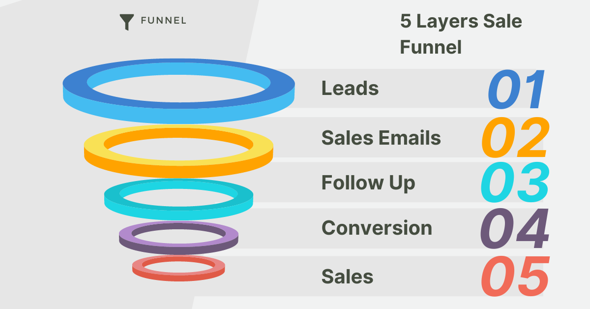
#4 Funnel Charts
Funnel charts illustrate how users journey through a lead acquisition or sales cycle. In diagram form, it looks like a string going from a larger segment at the top, to a thinner one at the button. During each stage of the process, the funnel’s width narrows indicating the number of users.
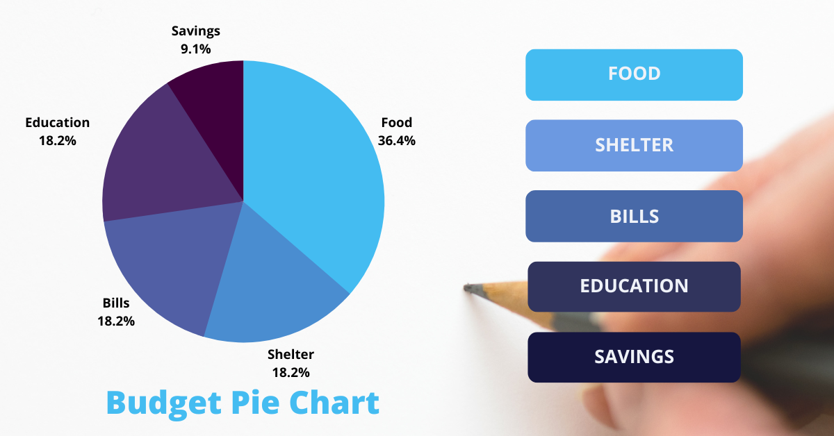
#5 Pie Charts
Pie charts show the ratio between portions and whole amount visually through a pictorial representation using proportional segments dividing a circle. Arch lengths correspond to fractions of each data set, with the complete arch representing the whole data set, equal to 100%.Therfore, in pie charts, the reader can quickly see how the data is distributed proportionally.
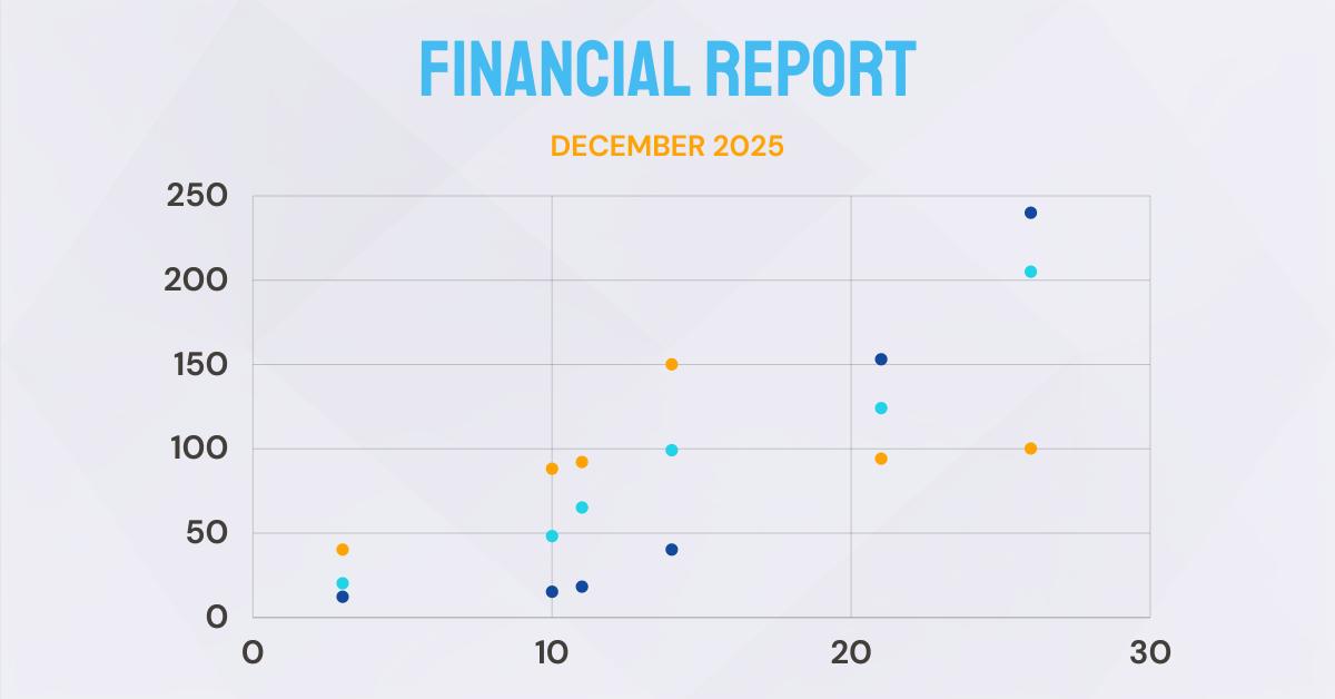
#6 Scatter Plots
A scatterplot is a type of graph that lets you view different measurements and their relationship with each other. In this type of visualization, various data points are presented between an x-axis and a y-axis. Each point appears scattered around the graph, that’s why it is called a scatterplot.
#7 Area Maps
Using an Area Map visualization, you can analyze and present geographically-related data in map format. This type of geographic data visualization is simple, precise, and easy to understand because we can visualize the pattern of data for each region.

Data Visualization FAQs
The following questions are the most asked ones about the visualization of data, which we address them.
1. What Is The Difference Between Data Visualization and Data Analysis?
- Data visualization is the process of transforming raw data into graphic formats while data analytics is the process of analyzing data sets to make decisions about the information they have, increasingly with specialized software and system.
- Data visualization lets you discover areas that require an in-depth review or optimization, identify factors that affect customer behavior, determine where products should be placed for example on your website, and estimate sales. But data analysis allows you to reveal hidden traces and assumptions, provides input for data visualization, and can enhance your business by predicting needs.
2. What Is The Best Way to Represent Data?
Data can be represented in tables, charts, graphs, and heatmaps and they can all be used in two ways the purposes are broad. It begins with the collection, organization, and analysis of data. Furthermore, it continues to present the results to a wider audience. Several factors impact picking the way to visualize data:
- Data type,
- The topics that are being asked about the data.
3. What Type of Visual Representation of Data Is Useful for Website Analysis?
A website heatmap is the best tool for website analytics. Heatmaps are an important feature in any website visitor tracking software, showing what activities and interactions took place on the website by visitors. With this type of visualization, you can determine which parts of your website are more engaging and which ones receive fewer interactions.
Heatmaps can be helpful in many different ways, like how to make your website more user-friendly, which parts are bothering visitors, how to make your website work better, and much more.
Thanks to tech, WatchThemLive as a full-featured CRO tool, has helped small businesses as well as enterprises to optimize their conversion rate using heatmaps that monitor and display user interactions on a website in real time.
Final Words on Data Visualization
The process of creating a visual expression of data to help people better understand and interpret the information is known as data visualization.
Data visualization platforms are used by digital marketers, designers, journalists, data scientists, and others to communicate information. Visualizing data can be used as a form of presentation or analysis.
Visualized data is an important part of our business lives. It has become an integral part of how we connect, learn about the world around us, and make decisions on what actions to take next.
So, if you own a website and wish to optimize it through visualized data, sign up on WatchThemLive now!